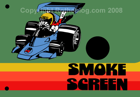
Bally’s Rally-X Control Panel Artwork Vectorized
Back around October Rich Lint told me that he would like to have the Rally-X control panel artwork vectorized. He knew that printing this artwork would be a long ways out (read probably a year), but it would be good to have ready to crank out when the time was appropriate. The Rally-X artwork was highly illustrative and exaggerated and was a little tricky in a couple of places to trace.

Items are extremely stylized on the racecar
I had some small chunks of time over my Christmas downtime in Michigan where I would spend 15 minutes here, a half an hour there working on this artwork. Certainly not enough time for design work, but for simple vector tracing – sure. I like to be free to just be there with family, but even activities have their in between moments and by the end of the week I had just enough time to finish this artwork up.

There were a couple detail spots that were hard to see on the Rally-X control panel scan on whether there should be lines or not. The artwork was so exaggerated to the point where I couldn’t just tell what the artist’s intention was because the tire reflections, the fingers, even the text was all big, loud and chunky.
Take a look the way the artist rendered what sort of look like wings on the Rally-X racecar. Are those beveled edges? Raised edges on an all black wing? The artist took some major liberties in their interpretation…

And look at some more detail on the inside of the helmet. I don’t even know what this broken line would have been because the helmet was reduced down to it’s essential elements without an curvature detailing.

In the end, I left the almost ‘noiselike’ dots and broken lines off in these two places and left the obvious details in. I think this is sweating the tiniest of details and at that fine of a line it would barely show up on the print anyway. Heck, most collectors probably couldn’t even see those unless I had blown up the detail to this size.
The midget racecar has spoken
Please don’t ask me how I am progressing on printing the Rally-X artwork. I find that I get this alot. Rich at ThisOldGame will be printing these sometime way off in the future, if you have questions about when they’ll be ready, ask him. I only report when the artwork is getting close to print ready.
Having said that, I probably won’t work on finishing this piece up just yet until I need to for some reason. I’ll still have to do the usual bleeds, traps and color separations. But at least Rich has this control panel so color matching will be quick and a cinch. Questions? Comments?
Here are some similar arcade posts
- Rally-X overlay separations finished
- Dig Dug Cabaret Control Panel Overlay Artwork
- Gunsmoke Control Panel Sticker Artwork
- Scramble Control Panel Repros
- Mr. Do! control panel overlay artwork
If you enjoyed this post, please consider to leave a comment or subscribe to the feed and get future articles delivered to your feed reader.
Comments
Those are just 4 straight-exhaust pipes. The highlights unintentionally make it look like a rolled lip. That is all.
Here is a site with examples.
I can tell now that they were exhaust pipes….the highlighting is still very strange, even for being exaggerated. That highlight that is on the second pipe from the left….what is that? Looks like it should be on the end only…and instead a full length highlight in it’s place.
I think that this was the effect that the artist was going for. You are just seeing more of the side on that second pipe due to perspective.
http://www.nonalignmentpact.com/uploaded_images/TubularBells-713673.jpg
The “line” you see on the helmet is the top edge of the GOGGLES the driver is wearing. The fan looking thing in front of him is his hands on the steering wheel (exaggerated of course).
@wavydave
I can respect an ‘effect’ but either the way it printed, or the way it was rendered, the strange choice of highlights almost make it seem like the artist didn’t have a good understanding how to properly resolve the pipes themselves down to the most necessary and easiest recognizeable elements. They say you can only break the rules after you understand them, and I don’t think on this particular piece they had an understanding of chrome surfaces, or something…I just can’t understand why they wouldn’t put bars of white / blue going the length of the pipes, even if that is the underside of them. Have those bars delineate where the openings are.
Leave a comment
Your email address is never displayed and cannot be spammed. If your comments are excessively self-promotional you will be banned from commenting. Read our comment privacy policy.


January 5, 2009
Wings?
Aren’t those just 4 exhaust pipes with highlights?
As you see, there are highlights at the ends of the pipes, and also some along the length of 2 pipes.