Make a classic arcade logo in 5 minutes
There was a topic thread started today on BYOAC where a member was trying to make a simple logo with a double thick outline. This is A-typical of arcade logos on flyers and designs from the 1980’s. Fortunately, making a similar retro arcade logo today is easy, it’s quick and only takes 5 minutes. So here we go, a short little how-to tutorial on designing your own old arcade logo.
Things you need for your logo
- Illustrator Software
- A basic knowledge of Illustrator
- A font of your choice, preferably something thick
- A name for your logo
- Knowledge of installing fonts on your computer
Adobe Illustrator Skill Level
Beginner / Basic
Additional Notes – Font Suggestions
- ‘Goya’ font – Art Deco Influences, Thick
- ‘Namco’ font – Pac-man inspired (Artifacts occur when over expanded)
Step 1:
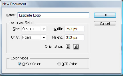
Open Illustrator and make a new file – Ctrl + N or File > New – and use these settings. You can call your new arcade logo file whatever you want, but I would set the orientation to horizontal.
Type out the name of your classic arcade logo using the ‘Namco’ logo. For this example I used ‘Lazicade’. There are plenty of tutorials on how to install fonts on Mac and Windows, font installation instructions are out of the scope of this article.
Step 2:
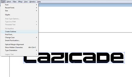
Select the logo, if it isn’t already, using the black pointer tool in the tools menu. Then create outlines of your text ‘Type > Outlines‘, meaning it will no longer be editable like normal text, so be sure you have the text you want.
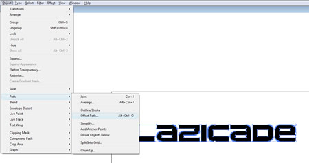
Then, go up to the Object > Path > Offset Path or as I have my shortcuts Atl + Ctrl + O.
You will get a dialog box with a couple of fields, set the ‘offset’ field to 4px, leave the other fields alone.
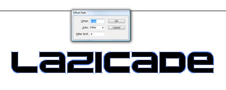
Your arcade logo will grow a little bit, overall the lettering will just look thicker.

Step 3:
Go up to the ‘Object’ menu, and select ‘Ungroup’. When you did an offset path, Illustrator made a copy of all of your characters and made them thicker. So you have the original outlined letters, as well as the new ones. You just need to ungroup them to edit the color fill easier. I have already done so, so you can see the two sets of lettering;
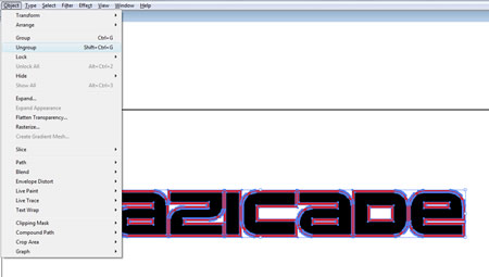
When ‘ungrouping’ your results may vary based on what font you choose for this tutorial. If you have a lot of characters with “O” and “A”, or any character that has a middle cutout section you may need to use the ‘expand’ (Object > Expand) menu option to break apart the individual characters to edit them.
Another tip if your arcade logo result doesn’t look the same as mine, you might need to adjust the stacking order of the artwork within the layers. Make sure your layers palette is open ‘Window > Layers‘ or F7.
In Illustrator you ‘send’ the artwork backwards in the stacking order. The shortcut to change the order is ‘Ctrl + [‘ to go backwards or ‘Ctrl + ]‘ to bring the art forwards. If you toggle shift in with that combo, it will send the artwork to the bottom or bring it all the way to the top – ‘Ctrl + Shift + [ / ]‘. Or you can go up to the file menu for each piece and choose Object > Arrange, and you will see all of the options listed above.
Adjust the stacking order until you get the result pictured above. Leave a comment with any questions since I didn’t write up a tutorial on this particular ‘arrange’ function in Illustrator.
Step 4:
The letters will no longer be selected, and you need to change the fill color. Hold the ‘Shift’ key, and select all of the letters in the middle, the original arcade lettering, and then change the fill color to white. You should have white lettering with red outlines.
Step 5:
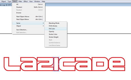
You can change the thicker lettering at any time. Select one red letter, go up to the menu and choose Select > Same > Fill Color. This will select all of the larger offset letters with a red fill, and you can then change them to any color you want.
Step 6:
With the red lettering still selected, we’re going to use offset again, and set the ‘offset’ value to 2px. We want to make an orange outline around the red. You can see the results in the arcade logos image in step 7.
Step 7:
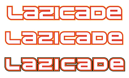
Now that we have a double outline (red & orange), some of the characters overlap. You just need to space the characters out. Use the shift key, and the black pointer to move the letters individually to the right to give them some breathing room. The first image is the initial logo with the letters overlapping, the second result is after I spaced the letters out.
Step 8:
I am going to repeat the offset process one more time, using the Select > Same > Fill Color for the orange lettering, using an offset value of 2px, and then changing the fill color to black to really make the logo pop. You can see the arcade logo that pops as the third and final example above
Why offset path works better than a stroke
When you use a stroke to outline letters, you can only add one stroke. However, this isn’t the point. If you look at this image you can see, the stroke is set on the middle of the path, so when you increase stroke size, it expands to the inside and to the outside. Eventually, you start to loose the shape of your original letter which you can see in the example image, the orange starts to disappear.
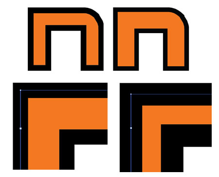
I also included a comparison of the same character using the offset method side by side to the stroke method. With offset path, you still get the appearance of a stroke, the same thickness, but you don’t lose the shape of the original character.
One other word of note, when making your old arcade logo design, make sure to choose a good arcade font. These free arcade fonts aren’t the best in terms of quality, and the whole logo is a pain to edit after you have made all of the offsets. As you can see, with the Namco logo, the edges are not smooth and the edges are personified as you make one and two offsets. Zoom in and check all edges before starting this tutorial.
There you go, a cool, retro looking arcade logo in 8 easy steps and you should be able to complete this logo design tutorial in about 5 minutes. Experiment, use your own colors, choose your own font, and make the arcade logo your own.
Here are some similar arcade posts
- Photoshop tutorial for punching text ‘effect’ out of an image
- How do I crop something in Illustrator? How do I use Clipping Masks?
- Vector Rock Ola Logo
- Professor Pac-man Marquee Artwork
- Closest Professor Pac-man font = ITC Grizzly
If you enjoyed this post, please consider to leave a comment or subscribe to the feed and get future articles delivered to your feed reader.


Comments
No comments yet.
Leave a comment
Your email address is never displayed and cannot be spammed. If your comments are excessively self-promotional you will be banned from commenting. Read our comment privacy policy.